
Simplified form syntax
In Ionic 7, the syntax for components such as Input and Select was greatly simplified. Until now, form-focused components like ion-input and ion-select had to be used together with ion-item and ion-label. In Ionic 7, you no longer need to combine them that way.
v6:
<ion-item fill="outline">
  <ion-label>Email:</ion-label>
  <ion-input placeholder="hi@ionic.io"></ion-input>
  <div slot="helper">Please enter a valid email address</div>
</ion-item>
v7:
<ion-input
  label="Email:"
  placeholder="hi@ionic.io"
  fill="outline"
  helper-text="Please enter a valid email address"
></ion-input>
Beyond simpler markup, you get these benefits:
- Form controls are now associated with labels, which improves accessibility
- Clearer APIs improve the developer experience.
- (Ionic itself becomes simpler to maintain, which should mean fewer bugs over time).
Basic form syntax changes
Here are syntax changes for several form controls. You can still use ion-item in Ionic 7 even though it is no longer required—I recommend using ion-item inside ion-list.
ion-input
v6:
<ion-item>
  <ion-label>Enter your name</ion-label>
  <ion-input></ion-input>
  <span slot="error">Please enter a name</span>
</ion-item>
v7:
<ion-input label="Enter your name" error="Please enter a name"></ion-input>
ion-textarea
v6:
<ion-item fill="solid" counter="true">
  <ion-label>Comments</ion-label>
  <ion-textarea maxlength="500"></ion-textarea>
</ion-item>
v7:
<ion-textarea fill="solid" counter="true" maxlength="500" label="Comments"></ion-textarea>
ion-select
v6:
<ion-item>
  <ion-label>Pick a color</ion-label>
  <ion-select>
    <ion-select-option value="red">Red</ion-select-option>
    <ion-select-option value="blue">Blue</ion-select-option>
    <ion-select-option value="green">Green</ion-select-option>
  </ion-select>
</ion-item>
v7:
<ion-select label="Pick a color">
  <ion-select-option value="red">Red</ion-select-option>
  <ion-select-option value="blue">Blue</ion-select-option>
  <ion-select-option value="green">Green</ion-select-option>
</ion-select>
ion-checkbox
v6:
<ion-item>
  <ion-checkbox slot="start"></ion-checkbox>
  <ion-label>I agree to the terms and conditions</ion-label>
</ion-item>
v7:
<ion-checkbox>I agree to the terms and conditions</ion-checkbox>
ion-radio
v6:
<ion-item>
  <ion-label>Grapes</ion-label>
  <ion-radio slot="end" value="grapes"></ion-radio>
</ion-item>
v7:
<ion-radio value="grapes">Grapes</ion-radio>
Advanced layouts
Real forms often do not follow these basic patterns. As advanced examples, let us look at form controls in various layouts.
Form controls without a visible label
When no label is shown, use aria-label to indicate what the control is for.
<!-- The label is displayed in this case -->
<ion-input label="Enter your name"></ion-input>

<!-- The label is not displayed in this case -->
<ion-input aria-label="Enter your name"></ion-input>
When design constraints mean you do not want a visible label, skip label and use aria-label.
Form controls whose label is not adjacent
Next, form controls whose label is not adjacent. Try building the layout below.

The v6 markup looks like this (non-critical code omitted):
<ion-item class="add-remove" lines="none">
  <ion-label slot="start">Quantity moved</ion-label>
  <ion-buttons slot="start" tabindex="1">
    <ion-button slot="icon-only" (click)="remove()">
        <ion-icon name="remove-circle-outline"></ion-icon>
    </ion-button></ion-buttons>
    <ion-input required tabindex="2"></ion-input>
    <ion-buttons slot="end" tabindex="1">
      <ion-button slot="icon-only" (click)="add()"><ion-icon name="add-circle-outline"></ion-icon></ion-button>
    </ion-buttons>
    <ion-text slot="end" i18n>units / 1 unit in stock</ion-text>
</ion-item>
If you simply add a label attribute to ion-input to match Ionic 7 form syntax, the label appears immediately to the left of the input and the layout breaks. Instead, use aria-labelledby to associate a non-adjacent label with ion-input, like this:
  <ion-item class="add-remove" lines="none">
-   <ion-label slot="start">Quantity moved</ion-label>
+   <ion-label id="label-amount" slot="start">Quantity moved</ion-label>
    <ion-buttons slot="start" tabindex="1">
      <ion-button slot="icon-only" (click)="remove()">
          <ion-icon name="remove-circle-outline"></ion-icon>
      </ion-button></ion-buttons>
-     <ion-input required tabindex="2"></ion-input>
+     <ion-input required tabindex="2" aria-labelledby="label-amount"></ion-input>
      <ion-buttons slot="end" tabindex="1">
        <ion-button slot="icon-only" (click)="add()"><ion-icon name="add-circle-outline"></ion-icon></ion-button>
      </ion-buttons>
      <ion-text slot="end" i18n>units / 1 unit in stock</ion-text>
  </ion-item>
You only add WAI-ARIA attributes. Easy.
Combining Shadow Parts components
ion-input and ion-textarea work with the approach above, but other form controls that render as Shadow DOM—such as ion-select and ion-toggle—cannot use aria-labelledby at this time. (Reference: https://github.com/ionic-team/ionic-framework/issues/26829#issuecomment-1438844711 )
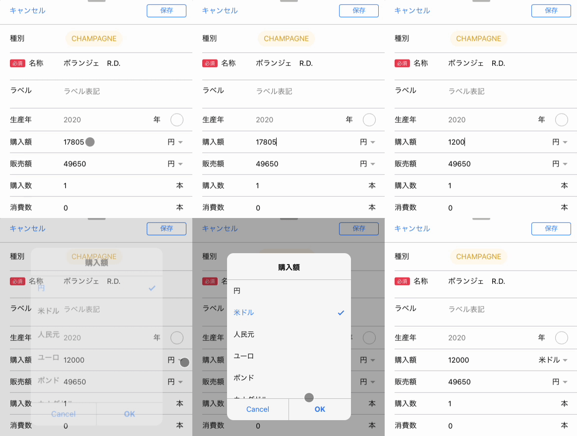
For those, use aria-label instead. See the example below.
<ion-item>
  <ion-input label="Purchase amount" labelPlacement="fixed"></ion-input>
  <ion-select
      slot="end"
      aria-label="currency"
      placeholder="Currency unit"
  >
      <ion-select-option *ngFor="let item of currencyCodes" [value]="item.code">{{ item.label }}</ion-select-option>
  </ion-select>
</ion-item>
ion-input shows its label on the left, so I set the label attribute on ion-input. The important part is ion-select: because it renders as Shadow DOM, use aria-label instead of aria-labelledby.
So markup like the following is wrong. Be careful.
<ion-item>
  <ion-label position="fixed" id="label-buy">Purchase amount</ion-label>
  <ion-button>Some component</ion-button>
  <ion-select
      slot="end"
      aria-labelledby="label-buy"
      placeholder="Currency unit"
  >
      <ion-select-option *ngFor="let item of currencyCodes" [value]="item.code">{{ item.label }}</ion-select-option>
  </ion-select>
</ion-item>
There is no label right next to ion-select, so you cannot set the label name with ion-select[label] (the order would swap). Also, because ion-select renders as Shadow DOM, you cannot point aria-labelledby at a label element. Avoid this layout if you can; when you cannot, set aria-label on ion-select.
Combining template conditionals

The Angular syntax makes this a bit hard to read, but *ngIf is a conditional: when the condition is true, that DOM is rendered.
<ion-item>
  <ion-label position="fixed" id="label-year">Vintage year</ion-label>
  <ng-container *ngIf="year !== 0">
    <ion-input aria-labelledby="label-year"></ion-input>
    <ion-text slot="end">year</ion-text>
  </ng-container>
  <ion-text *ngIf="year === 0">No vintage year (Non-Vintage)</ion-text>
  <ion-checkbox aria-label="Non Vintage" slot="end"></ion-checkbox>
</ion-item>
I want the label visible whether or not ion-input is present, so I use a real ion-label instead of ion-input[label]. On ion-input, I reference that label with aria-labelledby="label-year".
For ion-checkbox, the label lives in Shadow DOM, so use aria-label instead of aria-labelledby. aria-label sets the label text directly on the element.
Deferring migration
Sometimes you think, "This layout is hard with the new syntax—I want to change the design later!" In that case, legacy=true explicitly marks that you have not migrated to the new syntax yet.
<ion-item fill="outline">
    <ion-label>Email:</ion-label>
    <ion-input placeholder="hi@ionic.io" legacy="true"></ion-input>
    <div slot="helper">Please enter a valid email address</div>
</ion-item>
It is a temporary workaround, but handy to remember.
Summary
Once you leave the basic patterns, things get a bit tricky. I think this order of thinking works:
- Label immediately to the left of the form control →
label - Label is not adjacent && not Shadow DOM →
aria-labelledby - No label, or Shadow DOM →
aria-label - Still stuck →
legacy=true
The basic patterns are much easier to implement now, and that is a good thing.
See you next time.