

In web development, content usually flows top to bottom. The initial scroll position is at the top, so feed-style UIs like Facebook or X—where you read from the newest post downward—are straightforward to build.
Instagram, LINE, and X direct messages are different: you read from bottom to top, which breaks the usual web pattern.
- The initial view starts at the bottom
- New posts are appended at the bottom
- Scrolling up reveals older posts
For a long time, this pattern was a pain point in apps I built. To fake a bottom-anchored start, I used tricks like:
- Render everything, compute scroll offset from the top (with
opacity: 0at first) - Scroll to the bottom with JavaScript
- Set
opacity: 100after scrolling finishes
For infinite scroll when the scroll position neared the top, I would:
- Save the scroll offset before loading older content
- Measure height after older content appears
- Scroll by older content height plus the saved offset
Looking back, that was a lot of effort for "the web scrolls top to bottom, so it is what it is." This year I found a CSS feature that changes that, and I want to share it.
The savior: flex-direction: column-reverse;
Seriously—a lifesaver. According to MDN, browsers implemented it as early as ten years ago; even Firefox had support by September 2020. I wish I had learned it sooner. In short, it is a Flexbox property that reverses the vertical order of flex items.
And the initial scroll position is reversed too.
CodeSandbox has a very clear demo of this behavior:
.scrollTop is reversed as well: at the bottom, scroll offset is zero; as you move up, the offset grows. Prepending content at the top does not change scroll position. Perfect.
It only controls behavior inside the flex container, so you do need a large flex wrapper around the scroll content. With that constraint, Instagram-style messaging UI becomes easy to build.
The demo below uses Ionic Angular. Indices are reversed, so you can scroll from bottom to top.
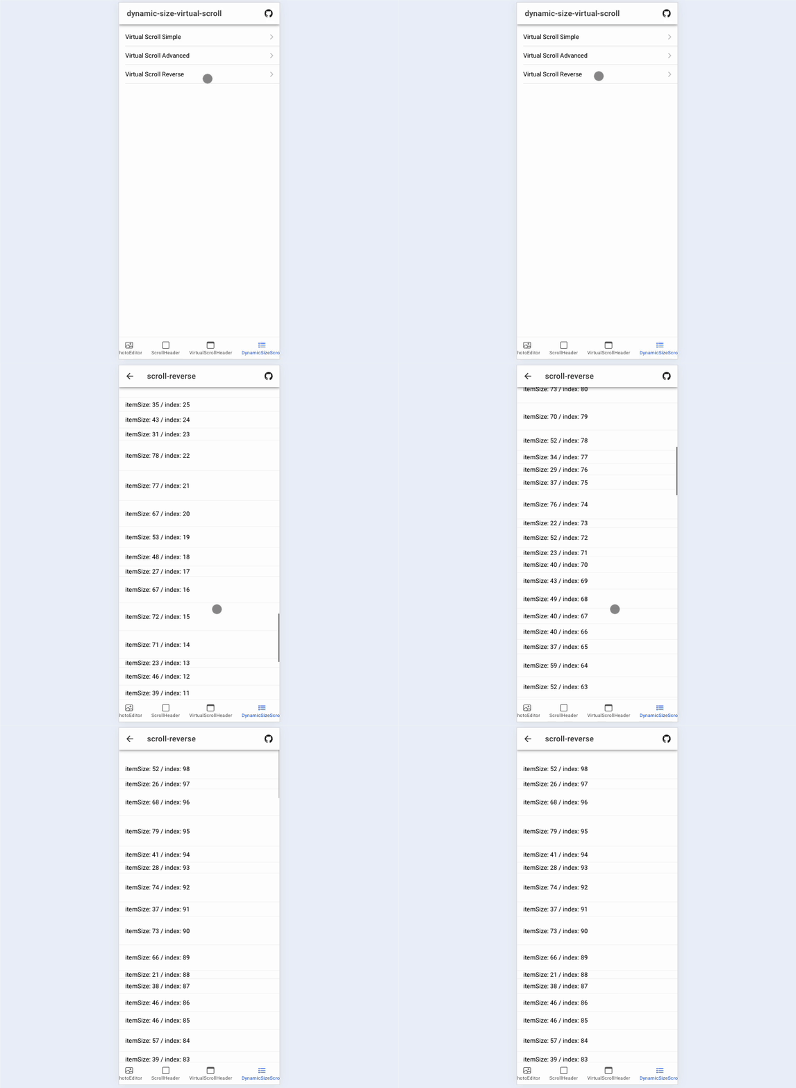
https://rdlabo-ionic-angular-library.netlify.app/main/scroll-strategies/reverse
How to use flex-direction: column-reverse;
That is it. Simple and great.
div.reverse-items {
  width: 100%;
  height: 100%;
  display: flex;
  flex-direction: column-reverse;
}
Summary
Bottom-to-top UIs like Instagram, LINE, and X messages are unusual on the web, but flex-direction: column-reverse; makes them easy to implement. I hope you use it to build more flexible web app UIs. Maybe I was just late to a well-known technique—who knows!
See you next time.