
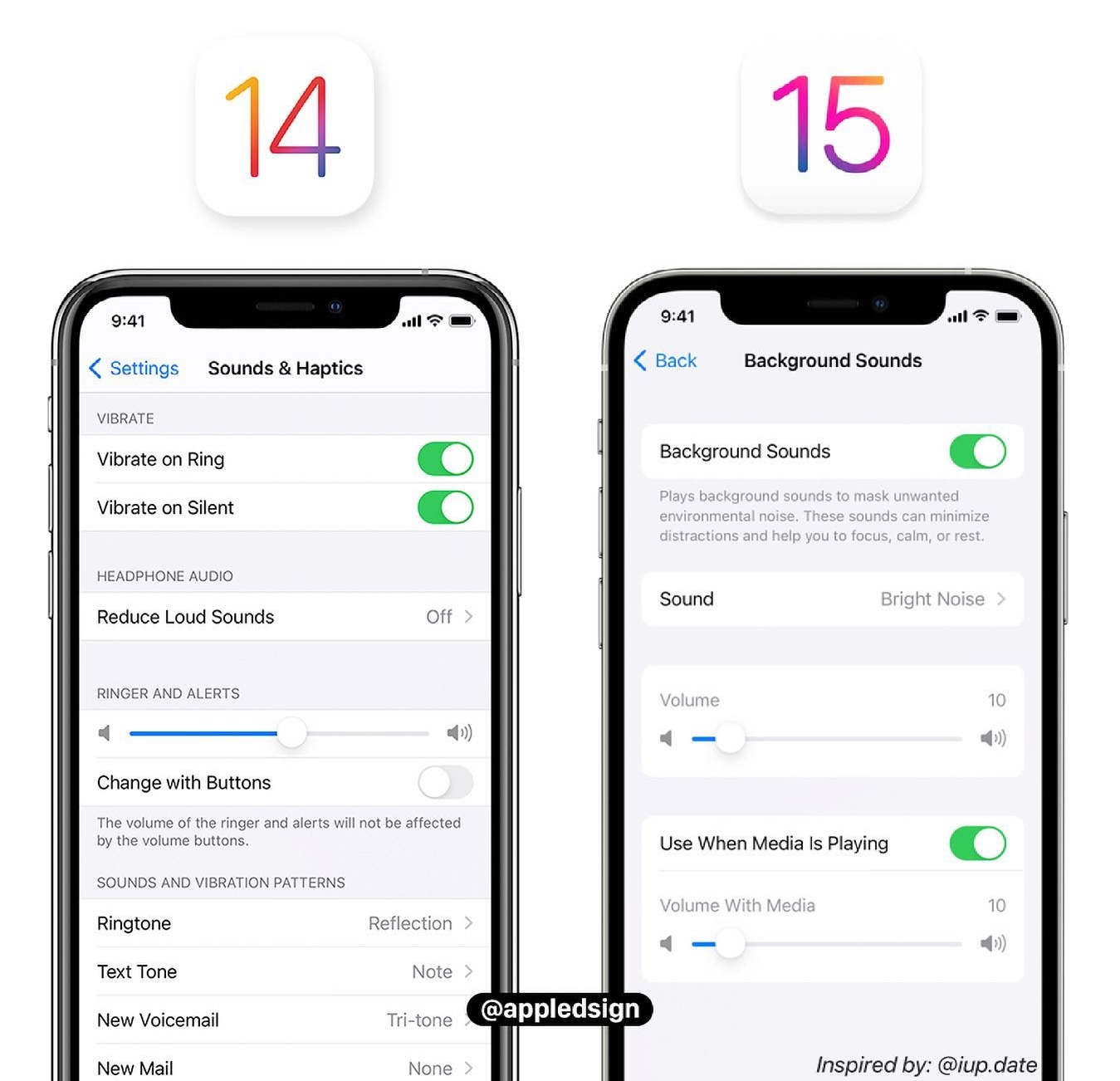
Since iOS 16, the Settings app design updated so content sections have margins on the left and right as well as top and bottom.
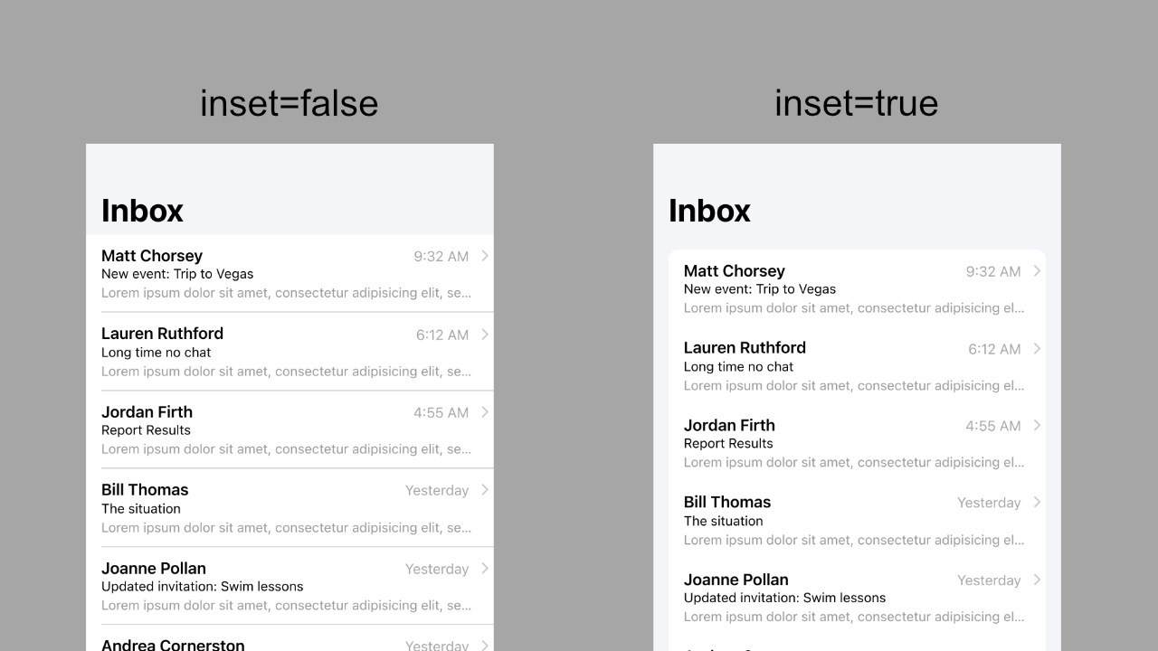
Ionic added an inset property on ion-list, so <ion-list inset=true> brings layouts closer to iOS 16 and later. It is opt-in rather than a default change so existing designs do not break.
Side by side, it looks like this (color=light on ion-toolbar and ion-content).
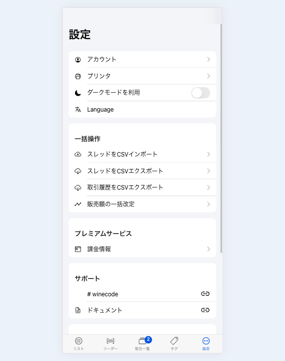
That works for this content, but to recreate iOS Settings you need icons on each row. Screens like "Payment & Shipping" also need list titles and item notes. Let's meet those requirements while keeping Ionic's base components.
Step 1: Set up the HTML
This is code extracted from a real product. Compared with the default pattern, the main change is adding ion-item-group. Icons follow the documented approach.
<ion-header [translucent]="true">
  <ion-toolbar color="light">
    <ion-title>
      Settings
    </ion-title>
  </ion-toolbar>
</ion-header>
<ion-content color="light" [fullscreen]="true">
  <ion-header collapse="condense">
    <ion-toolbar color="light">
      <ion-title size="large">
        Settings
      </ion-title>
    </ion-toolbar>
  </ion-header>

  <ion-list inset="true">
    <ion-item-group>
      <ion-item detail="true" routerLink="/main/settings/account">
        <ion-icon name="person-circle-outline" slot="start" size="small" class="menu-icon color-primary"></ion-icon>
        <ion-label i18n>Account</ion-label>
      </ion-item>
      <ion-item detail="true" routerLink="/main/settings/printer">
        <ion-icon name="print-outline" slot="start" size="small" class="menu-icon color-tertiary"></ion-icon>
        <ion-label i18n>Printer</ion-label>
      </ion-item>
      <ion-item>
        <ion-icon slot="start" size="small" class="menu-icon color-warning" name="moon"></ion-icon>
        <ion-toggle [(ngModel)]="isDark" (ionChange)="vm.changeTheme(isDark())"
        ><ng-container i18n>Use dark mode</ng-container></ion-toggle
        >
      </ion-item>
    </ion-item-group>
  </ion-list>
</ion-content>
With only this template, you should see something like this:
Step 2: Style the icons
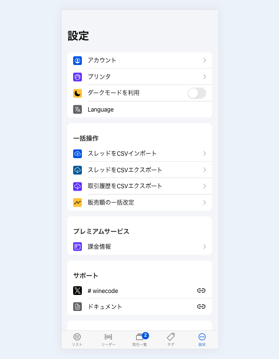
Next, style the icons. If the parent is always ion-list[inset=true] and icons are always ion-item ion-icon[slot=start], the menu-icon class is optional. Here I keep menu-icon for reuse and add color classes. Colors come from Ionic theme variables, but fixed values work too.
ion-icon.menu-icon {
  border-radius: 4px;
  padding: 3px;

  &.color-primary {
    background-color: var(--ion-color-primary);
    color: var(--ion-color-primary-contrast);
  }

  &.color-secondary {
    background-color: var(--ion-color-secondary-shade);
    color: var(--ion-color-secondary-contrast);
  }

  &.color-tertiary {
    background-color: var(--ion-color-tertiary);
    color: var(--ion-color-tertiary-contrast);
  }

  &.color-success {
    background-color: var(--ion-color-success-shade);
    color: var(--ion-color-success-contrast);
  }

  &.color-warning {
    background-color: var(--ion-color-warning);
    color: var(--ion-color-warning-contrast);
  }

  &.color-danger {
    background-color: var(--ion-color-danger);
    color: var(--ion-color-danger-contrast);
  }

  &.color-medium {
    background-color: var(--ion-color-medium);
    color: var(--ion-color-medium-contrast);
  }

  &.color-light {
    background-color: var(--ion-color-light);
    color: var(--ion-color-light-contrast);
  }
}
That gives you styled icons quickly.
Step 3: Style the list
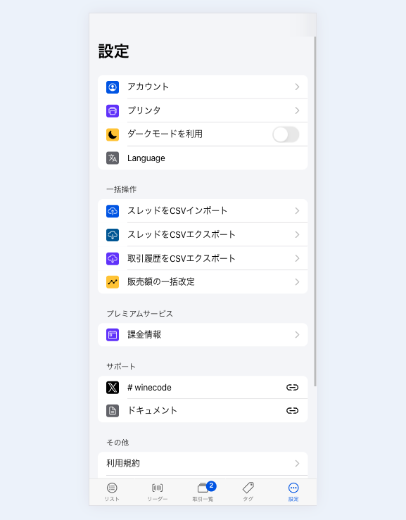
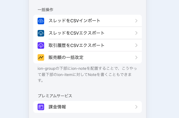
Finally, style the list. The main default issue is that ion-list[inset=true] has a background color. If you add titles or notes, they render inside that colored DOM. So make ion-list[inset=true] transparent and move the background to ion-item-group.
On iOS, items are rounded; Material Design is not, so border-radius applies only to ion-item-group.ios. Item dividers hide on the last item in a group (ion-item-group > :is(ion-item):last-child).
Nothing too exotic—if you read CSS, this should look familiar.
ion-content[color=light] {
  ion-list[inset=true] {
    &.list-inset {
      background: transparent;

      ion-list-header {
        ion-label {
          font-size: 0.9rem;
          font-weight: normal;
          margin: 8px 0 4px;
        }
        ion-note {
          font-size: 0.9rem;
          margin: 8px 16px 4px 0;
        }
      }

      ion-item-group.ios {
        border-radius: 10px;
        overflow: hidden;
      }

      ion-item-group > :is(ion-item):last-child {
        --border-width: 0px !important;
        --show-full-highlight: 0 !important;
        --inner-border-width: 0px !important;
        --show-inset-highlight: 0 !important;
      }

      & > ion-note {
        color: var(--ion-color-medium-tint);
        font-size: 0.9rem;
        display: block;
        margin: 8px 16px;
      }
    }
  }
}
The finished layout:
Summary
Ionic provides push transitions and navigation stacks—hard to implement performantly on the web. For backward compatibility it does not ship every small design tweak as a component, but with a solid base you can reach the design you want with CSS like this.
Split what the UI framework must own from what you can implement yourself, and you can design more efficiently.
See you next time.