
![[Ionic] I Want Collapsible Large Titles on Android Design Too! cover image](/article-images/adf4cf0d6d7114.svg)
Since Ionic 5, Ionic has supported Collapsible Large Titles. Before scrolling, a large title is shown; after scrolling, a smaller title appears in the header.

However, this works only in iOS mode (ios). You cannot use it in Android mode (md).
!
To improve cross-platform fidelity, Ionic renders the same component with iOS design on iOS devices and Android design on Android devices.
Android has adopted Collapsible Large Titles in recent years too. For example, here is the Settings screen on Pixel 5a / Android 12:

That means using Collapsible Large Titles with Android Design is no longer an anti-pattern (I think forcing Android to copy iOS-only behavior just for cross-platform parity is an anti-pattern).
So how do you use Collapsible Large Titles with Android Design?
The Naive Approach
If you force iOS design on Android, you can use Collapsible Large Titles on Android too.
<ion-header [translucent]="true" mode='ios'>
  <ion-toolbar>
    <ion-title>{{ title }}</ion-title>
  </ion-toolbar>
</ion-header>

<ion-content [fullscreen]="true">
  <ion-header collapse="condense" mode='ios'>
    <ion-toolbar>
      <ion-title size="large">{{ title }}</ion-title>
    </ion-toolbar>
  </ion-header>
Ionic components can be pinned to iOS design with mode=ios (use mode=md for Android design). Unless you specify otherwise, nested components inherit the parent mode, so this works.
But the title stays in iOS styling.

(Left is iOS design, right is Android design)
In Android design, page titles are left-aligned and relatively light weight. In iOS design they are centered and bold. The back button shape and other platform-specific settings get locked to iOS as well. I do not want that.
Why Android Cannot Use It Out of the Box
At https://forum.ionicframework.com/t/is-there-anyway-to-have-collapsable-title-on-android-too/219791, Mike replied that it does not work on Android because it is hard-coded for iOS. Let us find where.
First, the CSS that applies the design:
A lot is hard-coded into ion-header. Android disables it with this code:
I thought that if it is only display: none, maybe CSS could fix it, but then this hard-coding gets in the way:
The checkCollapsibleHeader method checks whether Collapsible Large Titles are configured, calculates scroll position, and controls the show/hide animation. It only runs when mode=ios...!!!!
However, the only place where ion-header behaves differently between iOS and Android is this Collapsible Large Titles branch. Height differences live in ion-toolbar, so maybe there is a chance??
Rethinking the iOS Mode Problem
In Android design, page titles are left-aligned and relatively light weight. In iOS design they are centered and bold. The back button shape and other platform-specific settings get locked to iOS as well. I do not want that.
That is not controlled by ion-header itself. It comes from nested ion-toolbar, which inherits mode from ion-header. So what happens if you set mode on ion-toolbar too?
<ion-header [translucent]="true" mode='ios'>
  <ion-toolbar mode="md">
    <ion-title>{{ title }}</ion-title>
  </ion-toolbar>
</ion-header>

<ion-content [fullscreen]="true">
  <ion-header collapse="condense" mode='ios'>
    <ion-toolbar mode="md">
      <ion-title size="large">{{ title }}</ion-title>
    </ion-toolbar>
  </ion-header>
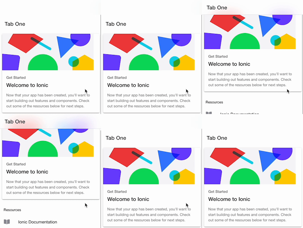
Nice, this is getting close to what I want. Android design does not have Large Title styling by default, so you need to add it separately. Add the following to global CSS. (For Japanese text, the top gets clipped a bit, so around 30px is easier to use.)
ion-title[size="large"] {
  font-size: 34px;
}

/* display:none may be loaded first, so override it with higher specificity */
ion-app.md .header-collapse-condense {
    display: block;
}
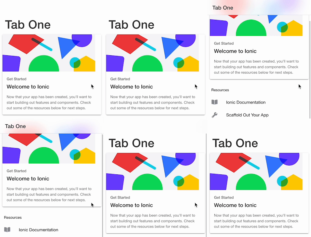
That covers most of the behavior. But this would also make iOS look like Android design, so use the Platform API from @ionic/angular to detect the device. On my Android device there was no blur effect, so I turned that off too.
<ion-header [translucent]="platform.is('ios')" mode="ios">
  <ion-toolbar [mode]="!platform.is('ios') ? 'md': undefined">
    <ion-title>Tab One</ion-title>
  </ion-toolbar>
</ion-header>

<ion-content [fullscreen]="true">
  <ion-header collapse="condense" mode="ios">
    <ion-toolbar [mode]="!platform.is('ios') ? 'md': undefined">
      <ion-title size="large">Tab One</ion-title>
    </ion-toolbar>
  </ion-header>
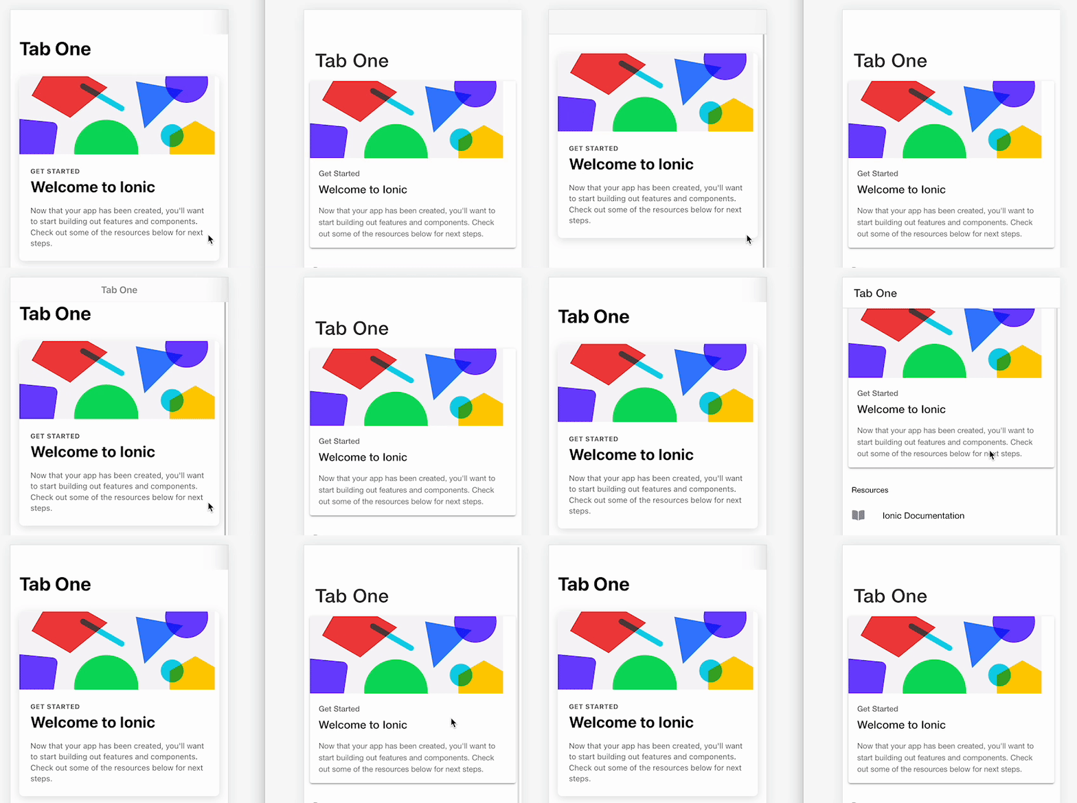
Left is iOS, right is Android. That is close enough.
Summary
I opened https://github.com/ionic-team/ionic-framework/issues/25157, but I think official support is still a while away. If you want Collapsible Large Titles on Android too, I hope this helps.
In a real product, specifying mode and platform on every page is tedious. A directive that applies this through DOM manipulation would be smarter.
See you next time.