
I maintain @rdlabo/ionic-theme-md3, a theme that applies Material Design 3 styling to Ionic Framework. It originally began as a compatibility theme for sharing the same HTML with @rdlabo/ionic-theme-ios26. Since then, it has grown to support more components, dark mode, page transitions, and visual regression testing—enough to stand on its own as a theme.
To start, here is the same demo using the same HTML in Ionic's standard md mode and with the theme applied. Standard Ionic is on the left; ionic-theme-md3 is on the right.
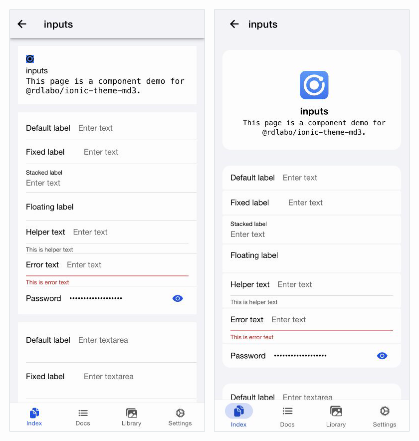
Inputs that appear as one continuous block in the standard theme are separated into individual surfaces. Spacing and rounded corners make each group of information easier to distinguish. The Header and Tab bar also change shape, transforming the overall impression of the screen while keeping the Ionic components themselves.
You can switch between components and Light and Dark modes in the interactive browser demo.
What is ionic-theme-md3?
ionic-theme-md3 is a CSS and JavaScript library that applies Material Design 3 styling to Ionic components. It works with Ionic React and Ionic Vue as well as Ionic Angular.
Ionic can display designs suited to both its ios and md modes from a single HTML structure. This theme preserves that approach: it brings in MD3 styling while retaining Ionic's component structure and usage patterns.
Getting started
Add the package to an Ionic project.
npm install @rdlabo/ionic-theme-md3
Then load the theme from the project's global CSS—typically src/global.scss or src/styles.scss in Angular.
@import '@rdlabo/ionic-theme-md3/dist/css/default-variables.css';
@import '@rdlabo/ionic-theme-md3/dist/css/ionic-theme-md3.css';
For basic Ionic components, that is enough to apply the theme without substantially rewriting existing HTML.
You can start by loading only the CSS and checking how existing screens change. To use the MD3 page transition as well, add the following configuration.
Using the MD3 page transition
In addition to CSS, the package provides mdTransitionAnimation for page transitions. With Ionic Angular, configure it in provideIonicAngular as follows.
// Ionic 9
import { isPlatform, provideIonicAngular } from '@ionic/angular';
// In Ionic 8, import from @ionic/angular/standalone
import { mdTransitionAnimation } from '@rdlabo/ionic-theme-md3';

provideIonicAngular({
  navAnimation: isPlatform('ios') ? undefined : mdTransitionAnimation,
});
For React, pass the same navAnimation option to setupIonicReact; for Vue, pass it to IonicVue. See the README for complete examples for each framework.
How Ionic components change
The current demo covers the Ionic components commonly used in apps, including Button, Card, Input, Checkbox, Segment, Tabs, Alert, Modal, and Toast.
Button
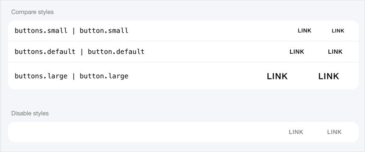
The theme retains existing Ionic APIs such as fill and size while applying MD3-style rounded shapes and state treatments.
Forms
Input and Textarea continue to support Ionic's existing label placements. The demo also covers states beyond the default, including helper text, error text, and password visibility.
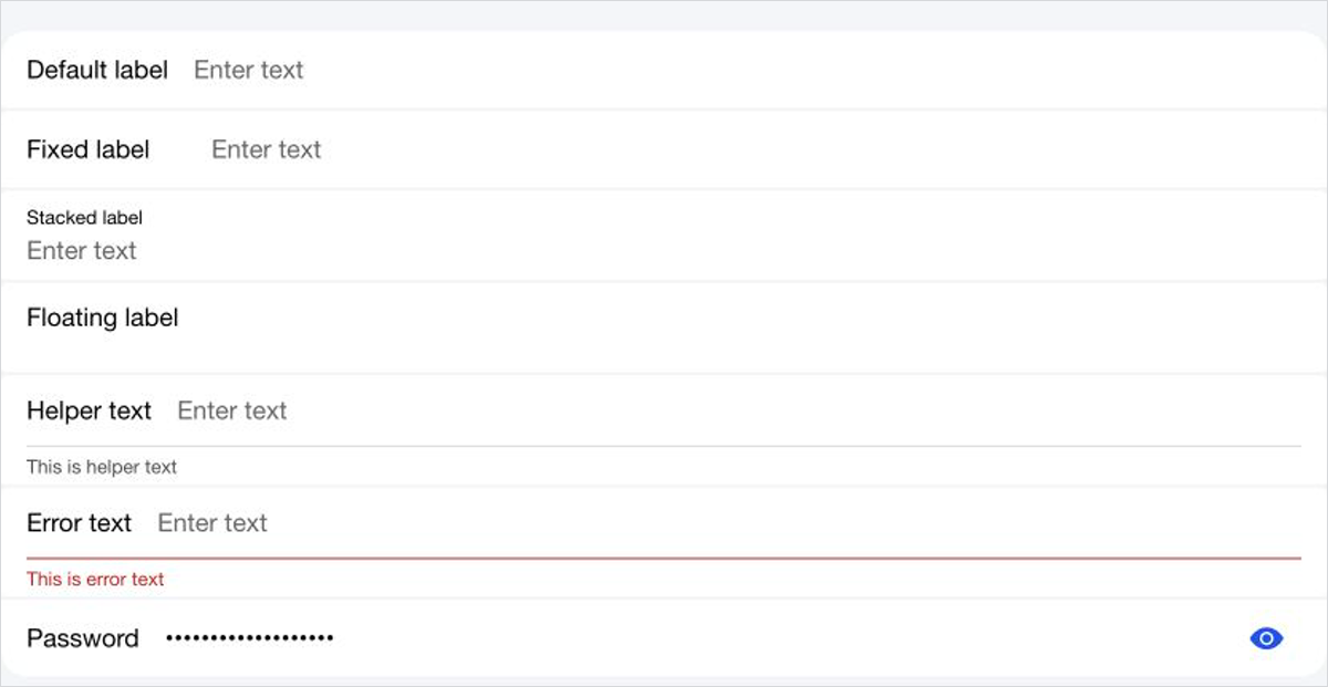
Looking only at a polished static state can hide problems that appear when a theme is introduced into a real app. That is why development also checks focus, error, and disabled states, along with cases where text grows longer.
Overlays
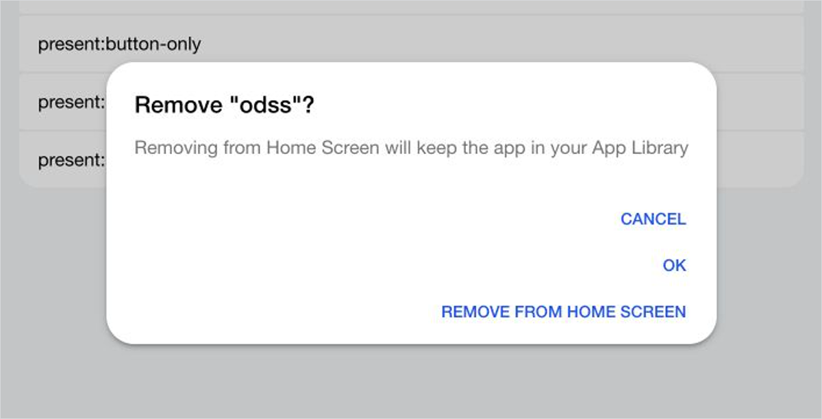
Overlays such as Alert, Action Sheet, and Modal are adjusted as a whole—including the backdrop, button placement, and animation, not just the container shape. Ionic's Controller APIs remain unchanged.
Adopt it incrementally
The theme can be disabled per DOM subtree, so you do not have to apply it to an entire existing app at once. Add .md3-disabled to a component that should retain Ionic's standard Material styling.
<ion-button fill="solid">MD3 theme</ion-button>
<ion-button class="md3-disabled" fill="solid">Standard Ionic</ion-button>
This lets you start with one screen or a small set of components and expand the theme's reach gradually.
Light mode and Dark mode
ionic-theme-md3 supports both Light and Dark modes using Ionic's standard Dark mode mechanism.
Light mode is on the left and Dark mode is on the right.
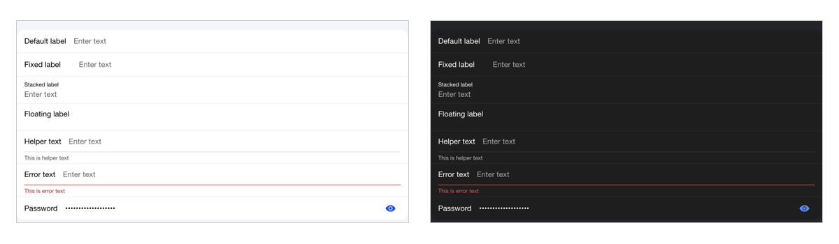
When using the CSS Class approach, remember to load Ionic's Dark palette as well. In Angular, that is the following file.
@import '@ionic/angular/css/palettes/dark.class.css';
Theme colors are based on CSS Custom Properties defined in default-variables.css, so they can be adjusted to match an app's brand colors. When changing colors, check Light and Dark modes together with normal, focus, and disabled states. Rather than imposing a fixed appearance, this theme can grow with an app's brand.
From a compatibility theme to a standalone theme
The original reason for creating this project was not to provide a standalone MD3 theme for Android.
The ionic-theme-ios26 theme I had developed first sometimes requires markup tailored to an iOS 26-style design. I created ionic-theme-md3 as a compatibility theme so that the same HTML would still render correctly in md mode.
At release, the iOS 26 theme naturally had higher priority, and an introductory article for the MD3 theme kept getting pushed back. Since then, however, the project has expanded its component coverage and gained Light and Dark modes, page transitions, Ionic 8 and 9 demos, visual regression tests, and migration documentation.
It is no longer only an accessory for using the iOS 26 theme. It has reached the point where I can recommend the MD3 theme on its own, which is why I am introducing it again now.
Growing the theme without breaking its visuals
The difficult part of a theme library is that successful CSS compilation does not mean the result looks correct.
The demo uses Playwright visual regression tests to capture every component route in both Light and Dark modes. This provides a way to detect how an Ionic update—or a fix for one screen—changes another screen without relying only on human memory.
Matching demo screenshots cannot guarantee correct rendering in every application, of course. It does, however, provide the foundation needed to keep expanding the supported components and states.
Switching between iOS 26 and MD3 with the same HTML
The following image shows the same Input demo screen in each theme. Material Design 3 is on the left and iOS 26 is on the right.
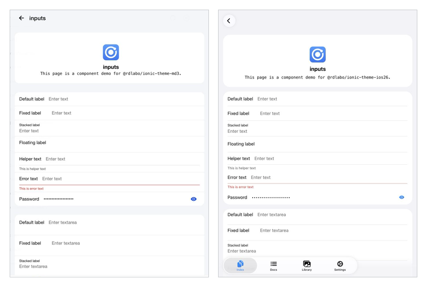
Sharing the same HTML avoids filling templates with conditions such as isPlatform('ios'). Markup for data and accessibility can stay shared while the theme takes responsibility for presentation.
When using both themes, load Sass in the following order.
@use '@rdlabo/ionic-theme-ios26/src/styles/default-variables.scss' as ios26-vars;
@use '@rdlabo/ionic-theme-ios26/src/styles/ionic-theme-ios26.scss';
@use '@rdlabo/ionic-theme-ios26/src/styles/ionic-theme-ios26-dark-class.scss';
@use '@rdlabo/ionic-theme-ios26/src/styles/md-remove-ios-class-effect.scss';
@use '@rdlabo/ionic-theme-md3/dist/css/default-variables.css' as md3-vars;
@use '@rdlabo/ionic-theme-md3/dist/css/ionic-theme-md3.css';
Page transitions and Popover animations can also switch according to Ionic's mode. The README includes a configuration example.
Because both themes use the same HTML, some components require shared markup that each theme can interpret cleanly. For example, in an ion-list with inset="true", wrap ion-item elements in ion-item-group and place ion-list-header outside the group.
<ion-list inset="true">
  <ion-list-header>
    <ion-label>Connections</ion-label>
  </ion-list-header>
  <ion-item-group>
    <ion-item>...</ion-item>
    <ion-item>...</ion-item>
  </ion-item-group>
</ion-list>
With this structure, iOS 26 can create the surface expected of an Inset list, while MD3 can style the same markup appropriately. Special cases are documented under Special markup.
Design goals and considerations before adoption
The theme's position and constraints are also important when deciding whether to adopt it.
- This theme prioritizes Ionic's design approach and compatibility with
ionic-theme-ios26; it does not aim to reproduce every Material Design 3 specification exactly. If you need a more comprehensive implementation,md3-for-ionicis another option. - Many Ionic components use Shadow DOM. Areas that do not expose CSS Custom Properties or
::partcannot be freely changed by a theme and may require adjustments when Ionic itself is updated. - Existing applications with custom CSS may encounter conflicts. Check the relevant components in the demo, and consult the Migration guide for major-version upgrades.
The project will continue to be transparent about these constraints while growing as a practical theme within the boundaries that preserve Ionic's APIs and markup.
Conclusion
ionic-theme-md3 began as a compatibility layer for the iOS 26 theme. It has now become a theme I can recommend independently for Ionic apps. If you want to try an MD3 look while keeping your existing Ionic components, start with the demo. In an existing project, the first experiment can be as small as loading two lines of CSS.
If you try it in a real app, I would be glad to hear how it went or which components still need attention. GitHub Issues and Pull Requests are both welcome.