
I have released v9.0.0 of two theme libraries that bring iOS 26 and Material Design 3 designs to Ionic apps.
Although the themes look very different, they are designed around the same Ionic component markup.
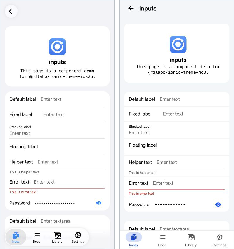
The iOS 26 design applies to Ionic's ios mode, while Material Design 3 applies to md mode. You can share the markup that carries data, events, and accessibility semantics without adding more isPlatform('ios') branches to your templates.
@rdlabo/ionic-theme-ios26:9.0.0@rdlabo/ionic-theme-md3:9.0.0
The main goal of this release is to align each theme's major version with the supported Ionic 9 release. Ionic 8 remains supported, and the demos, tests, and documentation now cover both versions so their visual differences can be checked side by side.
At publication time, 9.0.0 is the latest version of both packages. It includes the Ionic 9 support and UI work previously released as iOS26 theme 3.0.0 and 3.1.0, and MD3 theme 2.0.0 and 2.1.0. The v9.0.0 release itself aligns the major versions of Ionic and the themes, making compatibility easier to understand.
This article is for anyone upgrading from a version released last month or earlier. It summarizes everything that changed on the way to v9.0.0.
Release overview
| Package | Latest | Supported Ionic |
|---|---|---|
@rdlabo/ionic-theme-ios26 |
9.0.0 |
@ionic/core >=8.8.1 <10 |
@rdlabo/ionic-theme-md3 |
9.0.0 |
@ionic/core >=8.8.0 <10 |
For a new installation, install the latest releases.
npm install @rdlabo/ionic-theme-ios26@^9 @rdlabo/ionic-theme-md3@^9
Ionic 8 remains supported. This is useful not only for apps moving to Ionic 9 immediately, but also for teams that want to update the theme first and prepare for the framework upgrade in stages.
If you had already upgraded to ios26@3.x or md3@2.x just before v9.0.0, the appearance and application-side migration steps are unchanged. Only the package major version moves to 9 in this release.
One breaking change: replace a CSS class name
When upgrading from ios26@2.x or md3@1.x, the only required application-side change is the CSS class used for Inset List section headings.
- <ion-item-group class="header-item-group">
+ <ion-item-group class="item-group-header">
    ...
  </ion-item-group>
The old class has been removed from both themes. If your app does not use it, you can generally begin by updating the packages and testing the result.
This change was already introduced in ios26@3.0.0 and md3@2.0.0. If you use either of those versions or later, upgrading to v9.0.0 requires no additional markup changes.
See each theme's migration guide for details.
Four new features introduced in this update
1. Two-line List items, like those in Android Settings
Material Design 3's ListItem calls the information shown below the primary content supportingContent. This two-line pattern is common in Android's Settings app.
Both themes now support it. Place an ion-label and an ion-note without slots next to each other, and the note becomes Supporting text below the item label.
<ion-list inset="true">
<ion-item-group>
<ion-item>
<ion-label>Network & internet</ion-label>
<ion-note>Mobile, Wi-Fi, hotspot</ion-note>
</ion-item>
</ion-item-group>
</ion-list>
To stay true to Ionic's conventions, the themes provide only the layout and typography required for the two-line presentation. They do not decide icon shapes, colors, avatars, or item-specific decoration. The default remains a clean Ionic component layout.
iOS26 is on the left and MD3 is on the right. The /main/index/item-list demo shows the default two-line layout without page-specific decoration.
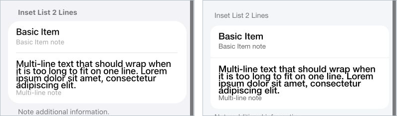
To keep supplementary content on the right as before, add slot="end" to the ion-note.
The default stops at two lines; a little CSS adds app-specific character
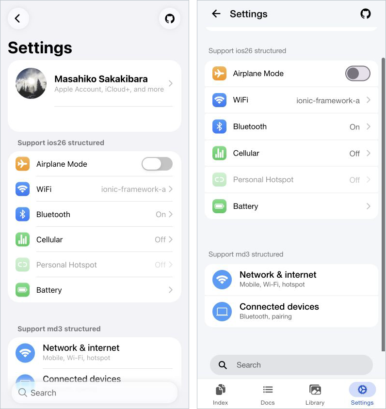
Because the default styling stays minimal, your app can add only the visual treatment it needs. In the /main/settings demo, page-specific classes and CSS turn the same Ionic components into rounded-square icons reminiscent of iOS Settings and circular MD3 icons. The CSS controlling shape and spacing is shown below.
.support-ios-structured ion-item > ion-icon[slot='start'] {
  padding: 4px;
  font-size: 1.3rem;
  margin-right: 14px;
  border-radius: 8px;
}

.support-md-structured ion-item > ion-icon[slot='start'] {
  padding: 8px;
  width: calc(40px - 16px);
  height: calc(40px - 16px);
  margin-right: 16px;
  border-radius: 50%;
  background: var(--ion-color-light-shade);
}
Each icon's color and gradient are specified through the HTML style attribute. The complete implementation is available in the Settings demo's HTML and SCSS.
iOS26 is on the left and MD3 is on the right. The left side shows a List with rounded-square icons; the right shows circular icons and two-line Items. The shared Ionic component markup remains the starting point, while app-specific CSS can take the design this far.
2. Check the List structure with an ESLint Rule from the companion package
For an Inset list in either theme, group ion-item elements inside ion-item-group, with ion-list-header outside the Group.
<ion-list inset="true">
  <ion-list-header>
    <ion-label>Connections</ion-label>
  </ion-list-header>
  <ion-item-group>
    <ion-item>...</ion-item>
    <ion-item>...</ion-item>
  </ion-item-group>
</ion-list>
The Ionic Angular @rdlabo/rules/require-ion-item-group rule can enforce this structure. It is included in the recommended configuration for @rdlabo/eslint-plugin-rules and detects an ion-item placed directly under ion-list, whether or not inset="true" is present.
Regular ion-list elements are also checked, but the themes apply their Inset List design only when inset="true" is set. Adding ion-item-group to a regular List therefore does not change its appearance. You can keep one consistent structure across all Lists and enable the Inset List design only where needed.
Simple cases support automatic fixes, so you do not have to find every migration omission by eye.
npm install --save-dev @rdlabo/eslint-plugin-rules
See Configuration for setup instructions.
The update also improves areas where shared markup was prone to visual differences, including final dividers and icon-only Buttons.
3. Form layouts with Helper and Error text in both themes
Both themes now lay out the existing helperText and errorText APIs from ion-input and ion-textarea naturally inside an Inset List. This does not add a new Ionic API; it integrates the existing Supporting text into each theme's List design.
Items with messages no longer show an unnecessary divider between the field and its Supporting text, and their spacing now makes both parts read as a single unit. The relationship between a field and its message is especially clear in the error state.
<ion-input
  class="ion-invalid ion-touched"
  label="Email"
  placeholder="name@example.com"
  errorText="Please check your email address"
></ion-input>
iOS26 is on the left and MD3 is on the right. The regular Inputs visible when the page first opens show how each theme handles Helper and Error text, dividers, and spacing.
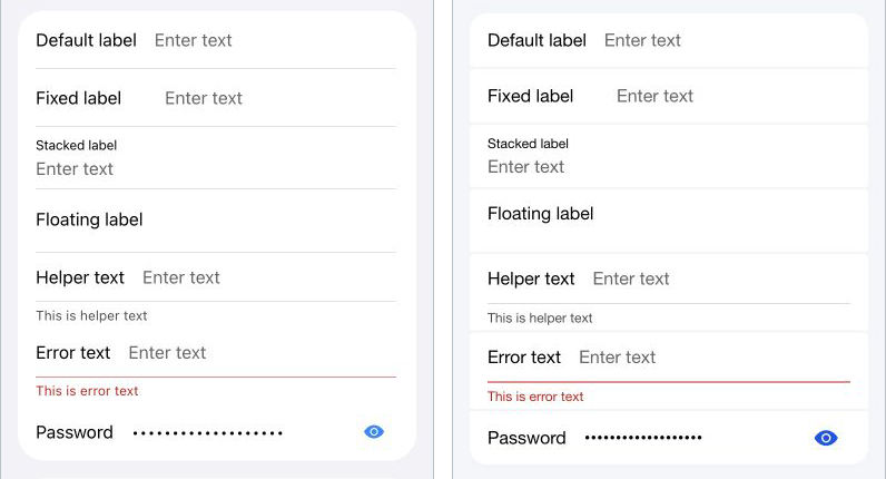
The behavior applies to regular Inputs and Textareas as well as Outline fields. The demos and visual regression tests now include states such as Focus, Invalid, and Touched.
4. Outline fields in the iOS26 theme's ios mode
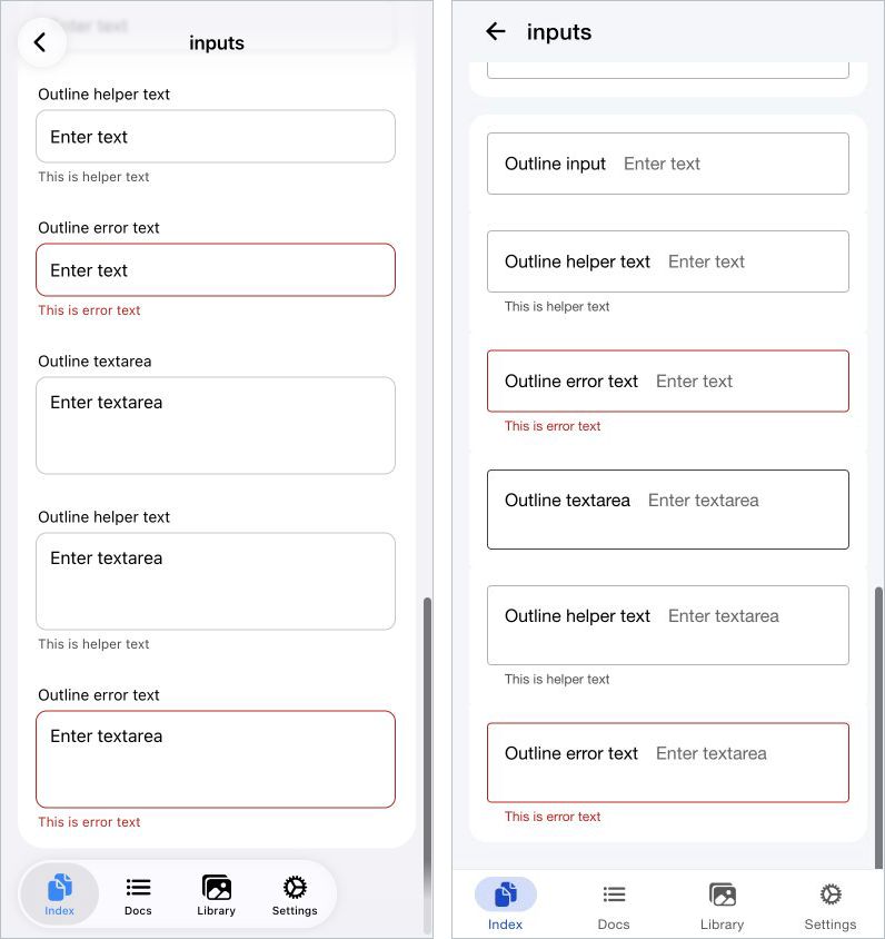
The iOS26 theme now supports fill="outline" for Inputs and Textareas. Ionic's own Outline field design is available only in md mode; there was no equivalent presentation in ios mode. With this theme, the same fill="outline" markup also works on the iOS26 screen.
The label sits above the border rather than overlapping it. The border and label react together, using the Primary color on focus and the Danger color for errors. Helper and Error text appears below the Field.
Because this extends Ionic's standard API, no dedicated component or custom attribute is required.
iOS26 is on the left and Material Design 3 is on the right. The screenshot is scrolled to the Outline fields and compares Inputs, Textareas, and states with Helper and Error text. Both modes render the same Ionic component markup.
<ion-input
  fill="outline"
  label="Email"
  placeholder="name@example.com"
></ion-input>
Three improvements included in v9.0.0
1. Use the themes with both Ionic 8 and Ionic 9
Ionic 9 reorganized its exports for Angular Standalone Components, changing the Ionic Angular import path.
// Ionic 9
import { isPlatform, provideIonicAngular } from '@ionic/angular';

// Ionic 8
import { isPlatform, provideIonicAngular } from '@ionic/angular/standalone';
You can update the themes in an existing Ionic 8 app before migrating the application itself to Ionic 9. The theme update and framework major upgrade do not have to happen at the same time.
The themes provide page transitions and Popover animations as well as CSS, so compatibility must cover navigation and Overlays—not just successful builds.
The same demo application is now built and published in separate Ionic 8 and Ionic 9 configurations.
Development uses the Ionic 9 version as the source of truth while continuing to verify the Ionic 8 rendering.
2. Protect Ionic 8 and Ionic 9 visuals with regression tests
For a theme library, successful TypeScript and Sass compilation does not guarantee the correct appearance.
The new visual regression suite captures every component screen on Ionic 8 and Ionic 9 in both Light and Dark modes. If Ionic changes its internal DOM or default styles, unintended visual differences can be reviewed in the Pull Request.
Coverage includes Alert, Action Sheet, Modal, Popover, Toast, Tabs, and Range in addition to Button and Input. Separate E2E tests verify page-transition animations.
The reference images are available on GitHub. Each component has both Light and Dark snapshots.
With an environment that compares the same components and states across Ionic 8 and 9, version support is backed by continuous visual verification rather than a declaration alone.
3. Document how to combine both themes and use Special markup
Sharing Ionic component markup between iOS26 and MD3 is not a new capability. This release formally documents how to install both themes in the same app.
Load the Sass files in the following order when using both themes.
@use '@rdlabo/ionic-theme-ios26/src/styles/default-variables.scss' as ios26-vars;
@use '@rdlabo/ionic-theme-ios26/src/styles/ionic-theme-ios26.scss';
@use '@rdlabo/ionic-theme-ios26/src/styles/ionic-theme-ios26-dark-class.scss';
@use '@rdlabo/ionic-theme-ios26/src/styles/md-remove-ios-class-effect.scss';
@use '@rdlabo/ionic-theme-md3/dist/css/default-variables.css' as md3-vars;
@use '@rdlabo/ionic-theme-md3/dist/css/ionic-theme-md3.css';
Page transitions can also switch with the Ionic mode.
import { isPlatform, provideIonicAngular } from '@ionic/angular';
import {
  iosTransitionAnimation,
  popoverEnterAnimation,
  popoverLeaveAnimation,
} from '@rdlabo/ionic-theme-ios26';
import { mdTransitionAnimation } from '@rdlabo/ionic-theme-md3';

provideIonicAngular({
  navAnimation: isPlatform('ios') ? iosTransitionAnimation : mdTransitionAnimation,
  popoverEnter: isPlatform('ios') ? popoverEnterAnimation : undefined,
  popoverLeave: isPlatform('ios') ? popoverLeaveAnimation : undefined,
});
For React, pass the same options to setupIonicReact; for Vue, pass them to IonicVue.
Theme-specific combinations are now collected as Special markup. The /main/docs demos show both the code and a preview rendered with actual Ionic components.
These pages are generated from each repository's docs/special-markup.md. The GitHub documentation and working demos now share the same source instead of being maintained separately.
Start with the demos and compare the same screen
These are not UI component libraries that replace Ionic. They extend the appearance and motion while preserving Ionic's components, modes, Controller APIs, and page transitions.
That is why opening the same component demo in both themes communicates the difference faster than a written explanation alone.
- iOS26 theme demo
- Material Design 3 theme demo
- iOS26 theme documentation
- Material Design 3 theme documentation
For an existing app, you can begin by loading the CSS and checking a single screen. The .ios26-disabled and .md3-disabled classes disable a theme for an individual DOM subtree, so adoption can be incremental.
Whether you are migrating to Ionic 9 now or preparing while maintaining Ionic 8, please open a GitHub Issue if a component's rendering catches your attention. States found in real applications can become the next visual regression cases.
Until next time.