

To explore what supporting iPhone Duo would involve, I built a small SwiftUI test app and spent a lot of time in the simulator. Swapping buttons, opening modals, navigating between screens—the investigation alone ate up several days 😂
With a foldable device, adapting to different screen widths is probably the first thing that comes to mind. But once I started using it, there was much more to look at: toolbar and tab placement, overflow menus, and even background animations.
I’ve collected those observations here for anyone considering Duo support in a cross-platform app. Let’s look at how the interface changes, with screenshots from the investigation.
1. Back buttons and tabs move to vertical bars at the side
On Duo’s outer display, and on the inner display in landscape, toolbar actions and tabs appear along the side of the screen. This area is called “vertical bars.” System information such as the time and connectivity status appears on the same side.
In portrait on the inner display, the bars sit at the top and bottom instead. Being on Duo does not mean the bars always move to the side. Designing for iPhone Duo
Here is the same Button screen on a conventional iPhone and a folded iPhone Duo.
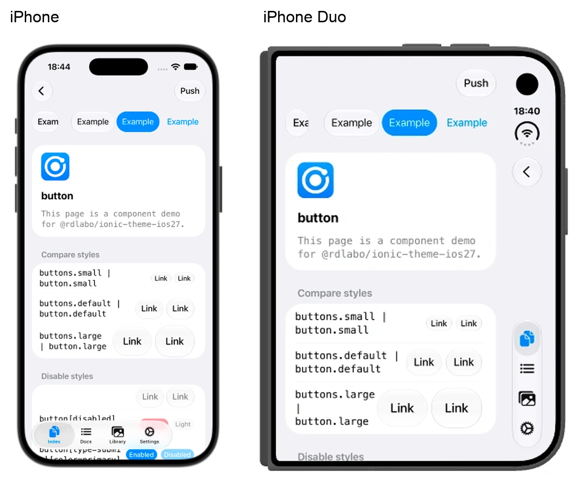
Left: a conventional iPhone simulator. Right: a folded iPhone Duo simulator. Both show the Ionic Button demo. The devices have different screen aspect ratios.
On the conventional iPhone, the back button is at the top left and the tabs are at the bottom. On Duo, both move into the vertical bars on the right, while the text button labeled Push stays at the top.
Toolbars and tabs integrated into the standard view structure adapt to this layout. Apple also distinguishes bars that belong to a container from standalone bars, which are not rearranged in the same way. Raise the bar with iPhone Duo
On Duo, the list itself fits inside the safe area
On a conventional iPhone, a list cell’s background extends across the screen, while its text and controls stay within the safe area. Apple illustrates this distinction with a landscape list in Building Apps for iPhone X (9:22–11:36).
With vertical bars on Duo, however, the list’s bounds and its cards also fit inside the safe area on that side. The entire list stops before the bars, rather than just keeping text and detail buttons clear of them. Apple’s explanation likewise places the entire foreground, including the cards, inside the safe area.
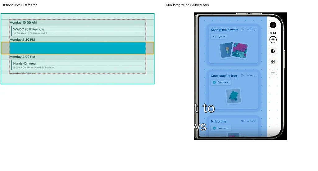
Left: Building Apps for iPhone X at 9:43. The yellow cell outline spans the width, while its content is inset within the red dotted safe-area boundary. Right: Prepare your app for iPhone Duo at 6:55. The blue foreground, including the cards, stops before the vertical bars.
| Element | Conventional iPhone | Duo with vertical bars |
|---|---|---|
| Text, detail buttons, and other controls | Stay inside the safe area | Stay inside the safe area |
| List bounds | Cell backgrounds span the width; text and controls are inset | The entire list stays inside the safe area on the vertical bars side |
| Page background | Extends to the edges of the screen | Extends behind the vertical bars |
The space above the header is separate from the safe area
Compared with the Settings app on a conventional iPhone, Duo positions titles and buttons lower to align with the vertical bars, leaving more space above the header. Yet the top safe-area value had not increased to match that visual change. The safe-area value alone does not tell you how the appearance differs from a conventional iPhone.

A crop of the top of Settings, showing the relationship between the title and system information.
Safe-area dimensions and placement are not fixed
In this environment, the safe-area inset on the vertical bars side was 84pt. To determine the space available for content, both the position of the bars and the inset—the distance from the edge—matter. A fixed margin is not a substitute for the dimensions reported by the device.
Personally, I don’t expect Apple to keep the same dimensions forever. I can imagine this design appearing on a future iPad, too, which is another reason I want to read the actual inset.
Native points, CSS pixels, and the pixels in a screenshot are also different units. A distance measured in screenshot pixels cannot simply be used as a layout value.
2. A button’s label determines where it moves
Next, let’s look at which buttons move. Of the buttons I placed in the toolbar, Save and Share moved into the vertical bars, while Select and the cart with $42 stayed in horizontal toolbars.
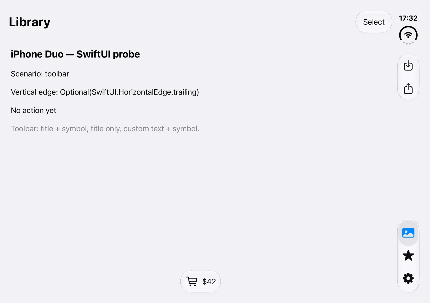
The SwiftUI test app on Duo’s inner display, using the same button configuration as the code below.
Let’s take a closer look.
Save and Share are standard buttons with an action title and an icon. The cart with $42, on the other hand, uses a custom label that displays the icon and price together. Here is the code corresponding to the screenshot.
.toolbar {
    ToolbarItem(placement: .topBarTrailing) {
        // Text-only button → stays in the horizontal toolbar
        Button("Select") {}
    }

    // Grouped icon actions → move together into the vertical bars
    ToolbarItemGroup(placement: .topBarTrailing) {
        Button("Save", systemImage: "square.and.arrow.down") {}
        Button("Share", systemImage: "square.and.arrow.up") {}
    }

    ToolbarItem(placement: .bottomBar) {
        // Custom label that always shows an icon and text → stays horizontal in this test
        Button {} label: {
            HStack {
                Image(systemName: "cart")
                Text("$42")
            }
        }
    }
}
| Button in the code | Position in the screenshot |
|---|---|
Button("Select") |
Select at the top right; stays in the horizontal toolbar |
Button("Save", systemImage: ...) |
The upper icon on the right, with a downward arrow; moves into the vertical bars |
Button("Share", systemImage: ...) |
The icon below it, with an upward arrow; moves into the same group as Save |
The button containing the cart Image and Text("$42") |
The cart and $42 at the bottom; stay in the horizontal toolbar |
If you do not want automatic placement, native APIs also let you specify it. SwiftUI’s axisBehavior
Icons moved into the ellipsis menu need text labels
When the actions no longer fit in the vertical bars, they are collected into an ellipsis menu—the overflow menu. This menu displays action titles alongside the icons.
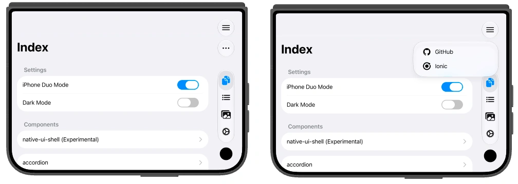
Left: the ellipsis button. Right: the open menu, with GitHub and Ionic displayed alongside their icons.
If a button has only an icon and no action title, its text area in the menu is blank. Even if a button normally displays only an icon, it needs an action title when it can move into the vertical bars.
The Save in Button("Save", systemImage: ...) above also provides the title shown in the menu. You may intend to show only an icon, but once it moves into a menu, that name becomes necessary.
3. Even text-only tabs move into the vertical bars
Tabs moved into the vertical bars whether they contained only an icon or only text. In their normal state, what you see is the icon.
| Tab content | Observation |
|---|---|
| Icon and text | Moves into the vertical bars; normally displays the icon |
| Icon only | Moves into the vertical bars |
| Text only | Moves into the vertical bars, but has no icon to identify it in its normal state |
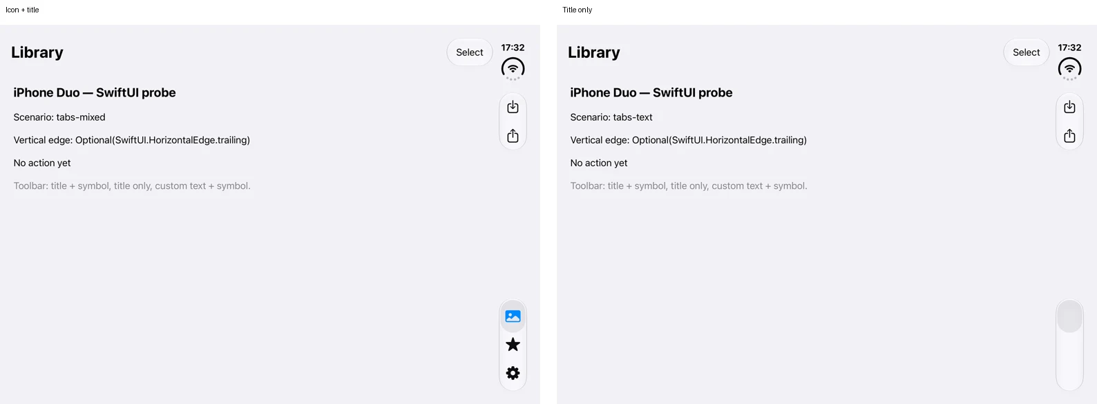
The same SwiftUI test app at the same display size. On the right, the tab area exists, but the names are not displayed.
Text-only tabs move too, but their text is not normally visible. The tabs are still there—you just lose the visual cues that identify them.
Tab names appear on hover or while pressing and dragging
Labels appear when you hover over tabs, or press and drag across them. In the simulator, pressing and dragging also revealed the tab names.
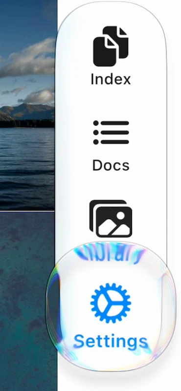
A crop of the lower-right area of an Ionic app on Duo, while pressing and dragging from the native Library tab toward Settings.
The labels extend beyond the narrow width of the vertical bars. The normal icon-only presentation is compact, but it changes quite substantially during interaction.
After seeing this, I would give tabs both an icon and a name. The icon identifies the tab normally, and the expanded label lets you confirm its name.
When space is tight, only the selected tab may remain visible
Toolbar actions and tabs share the same vertical bars. The number of visible tabs changed depending on which of them was given priority for the available height.
With toolbar actions prioritized, adding more actions could leave only the selected tab visible. The tabs had not been removed; their presentation was compressed.
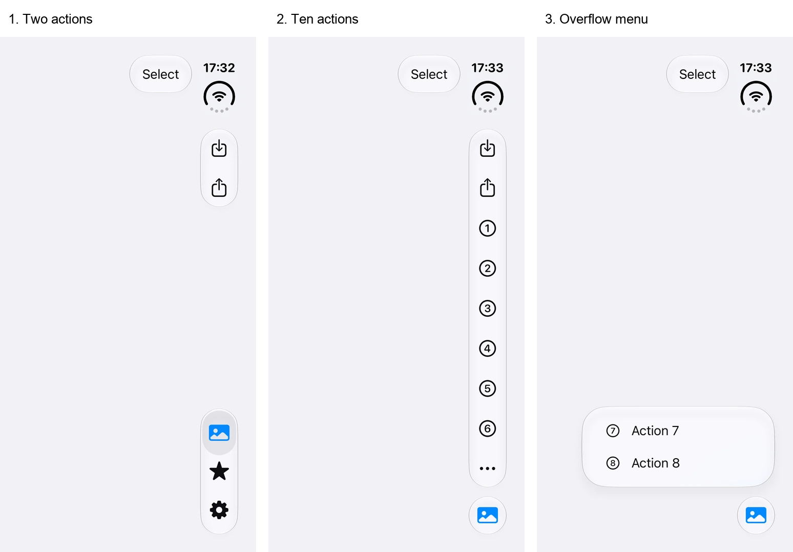
The same device and display size, with toolbar priority unchanged. Each image is a crop of the right side containing the vertical bars.
| From left to right | Toolbar actions | Tab presentation |
|---|---|---|
| 1 | Two actions: Save and Share |
All three tabs appear |
| 2 | Eight more actions, for a total of ten | Only the selected tab remains visible; actions 7 and 8 go into the ellipsis menu |
| 3 | The ellipsis menu from image 2 is open | The selected tab remains visible, and the menu shows Action 7 and Action 8 |
This priority can be specified through native APIs. I hadn’t noticed the behavior on screens with only a few actions, so screens with lots of buttons are worth checking as well. Compression behavior
4. Sheets and full-screen modals place controls differently
In a centered sheet, controls stayed inside the sheet. In a full-screen modal, the close icon moved into the vertical bars. I compared them in the same SwiftUI app with the device in the same orientation.
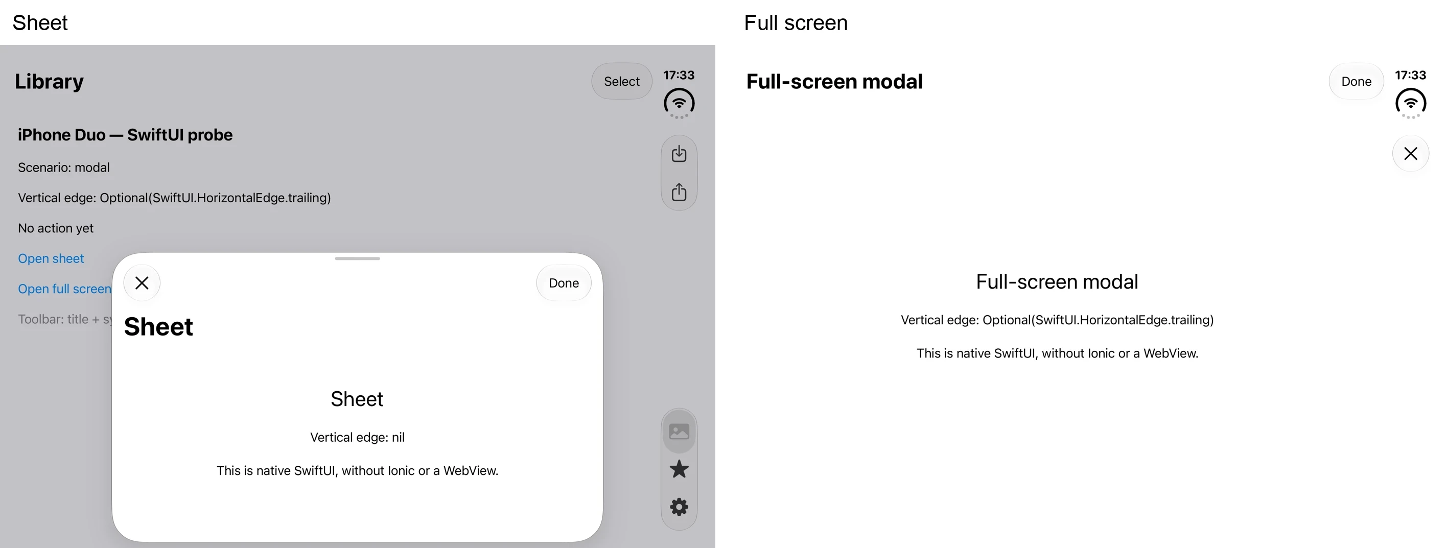
Left: a centered sheet. Right: a full-screen modal. Both use the same device and orientation.
| Presentation | Close icon | Done text button |
toolbarVerticalEdge |
|---|---|---|---|
| Centered sheet | Horizontal toolbar inside the sheet | Horizontal toolbar inside the sheet | nil |
| Full-screen modal | Vertical bars | Top of the screen | trailing |
toolbarVerticalEdge describes the available vertical bars placement for that view. nil means there is no available placement; trailing referred to the right side in this environment. While the full-screen modal was open, the tabs from the underlying screen were not displayed either.
Placement information varies by view, including sheets; it is not a single value shared across the whole device. Apple also explains that whether a sheet touches the edge on the vertical bars side matters. Raise the bar with iPhone Duo
5. Page backgrounds move behind the vertical bars too
So far, we have looked at where controls go. Navigating between screens reveals something else: the page background also moves behind the glass of the vertical bars.
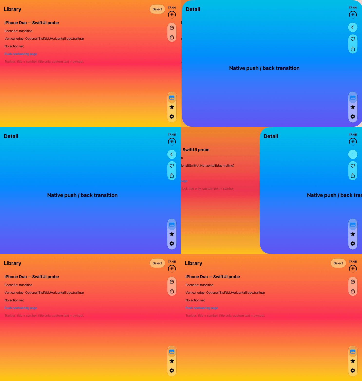
The SwiftUI test app, navigating forward and back between pages with different background colors.
The changing color visible through the glass shows that the page background continues behind it. This was easy to miss in still images.
You can also see the rounded page corners during transitions. Once you look beyond button placement to the background’s movement, there is more to pay attention to.
Adding or removing buttons changes the shape of the glass
Changing the number of toolbar buttons also changed the shape and size of the glass surrounding the action group.
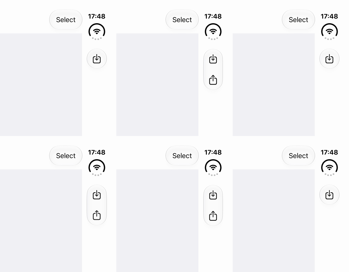
A crop from a recording of the Share button being added and removed on the same page. I repeated the operation six times with a SwiftUI animation specified.
There are two things to watch here: the page transition behind the bars, and the changing shape of the glass around the actions.
6. Folding changes the layout even when the screen width stays the same
Finally, let’s leave the device half open. In Settings, the sidebar width changed even though the screen width did not.
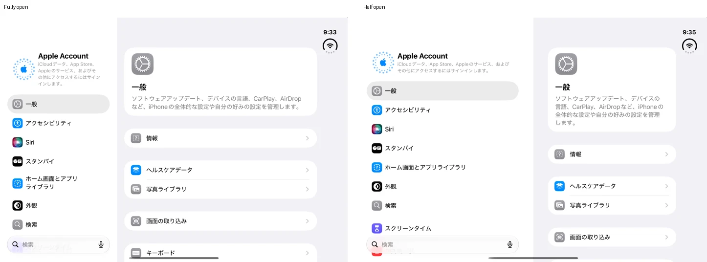
Left: fully open. Right: half open. Both show the General page in Settings.
In the Settings app I tested, the sidebar was 320pt wide when fully open in landscape, and occupied half the screen when the device was half open. In the latter state, the list and detail views sit on opposite sides of the hinge.
Both use the inner display in landscape, with a display size of 951 × 669pt. A width-based media query cannot distinguish these states. The folding state and the division created by the hinge also affect the layout. Strike a pose with adaptive layouts on iPhone Duo
Display sizes observed in the simulator
These are layout dimensions in points.
| Display | Orientation | Observed size |
|---|---|---|
| Outer display | Portrait | 466 × 678 |
| Inner display | Landscape | 951 × 669 |
| Inner display | Portrait | 669 × 951 |
7. Check what changes after a screen opens
Placement does not change only when a screen first opens. Folding, rotating, and opening or closing the search field or keyboard can change the appearance of the same page. In the Ionic app on Duo, I also observed the search icon expanding into an input field and returning to an icon when closed.
When trying this in your own app, I would go beyond the initial screen and work through these interactions:
- Switch between the outer and inner displays, and compare portrait, landscape, fully open, and half-open states.
- Add buttons and check that their action titles are still clear after they enter the ellipsis menu.
- Press and drag across tabs, checking both the normal icons and the expanded names.
- Open centered sheets and full-screen modals, and follow the control placement through dismissal.
- Navigate forward and back, and add or remove buttons, watching the backgrounds and glass.
- Open and close search repeatedly, and check the tabs while the keyboard is visible.
- After rotating or returning to the app, check whether placement responds without requiring another page navigation.
Toward a UI where the device decides placement
The same button moves to the side, becomes a menu item when it no longer fits, and the screen’s division changes when the device is half open. What stood out to me was the shift in who decides placement. We already adapt layouts to screen size, but where buttons and tabs go has traditionally been part of the UI we design for an app. On Duo, the device takes the actions provided by the app and rearranges them to suit its current state.
I’m curious whether this approach will stay specific to iPhone Duo, or combine with ideas such as Material You that adapt the interface to the user. Could we move toward a UI that chooses better placement for the person using it, based on more than just device information?
Investigation method and references
I used a standalone SwiftUI app to investigate buttons, tabs, modals, and transitions. The screenshots also include an Ionic app to illustrate placement, and Settings with the device half open. These are Apple’s explanations: